I'm working on some paintings to submit to the prestigious annual ROI (Royal Institute of Oil Painters) Exhibition at the Mall Galleries in London. Here are three possible candidates for submission to the selection committee next week:
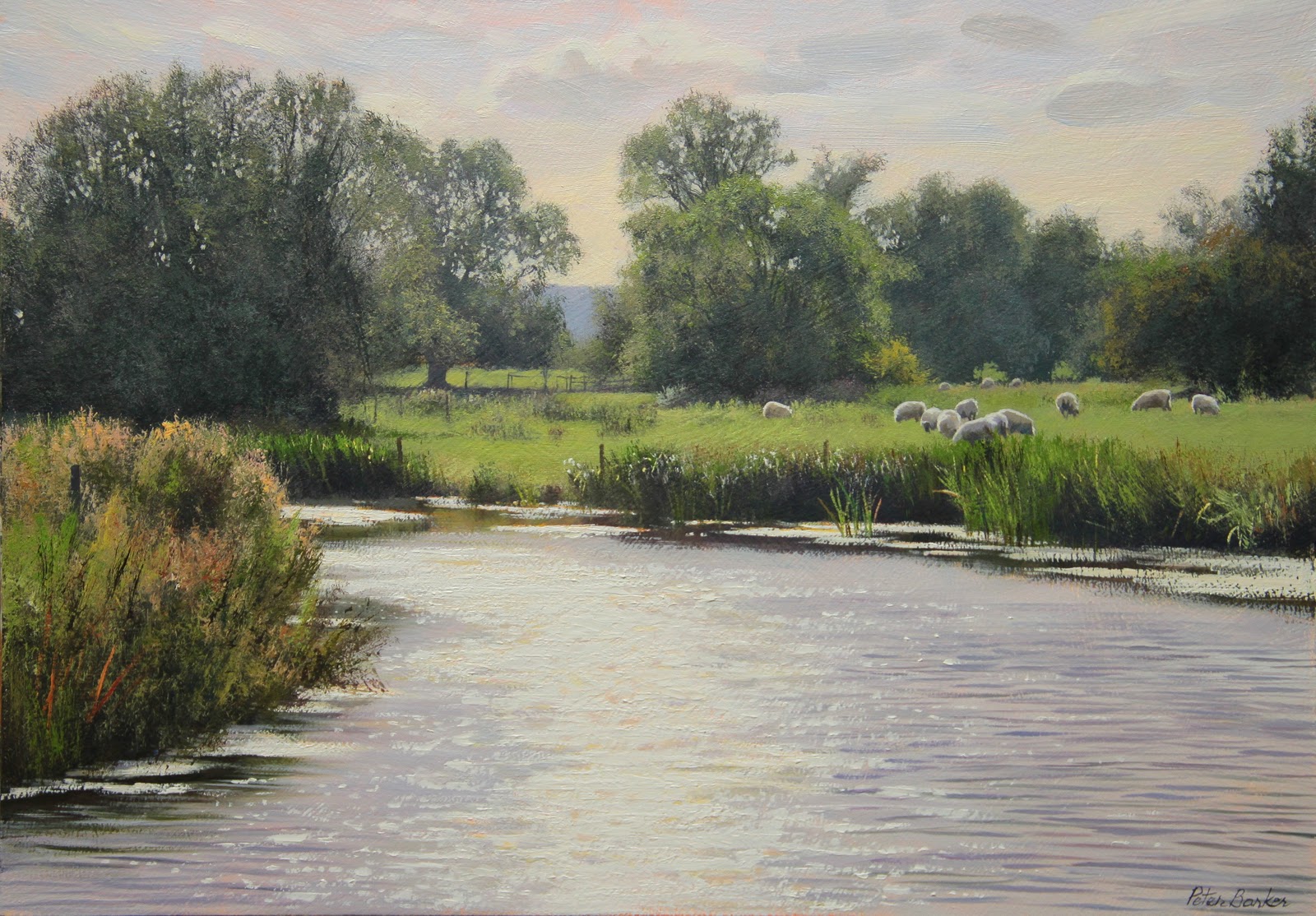
Dazzling Water, Oil on Board, 12 x 17 inches
This was a typically breezy September afternoon, looking directly into the sun. One second the water was calm with reflections of the trees, the next it was ruffled by the breeze which had the effect of reflecting the brilliant sunlight way above the tree-line. As I've said before, Titanium White Oil paint is hopelessly inadequate to portray the brilliance of pure sunlight, but with a few tricks, you can assimilate the effect. When you squint at such dazzling light, and you have too, of course, you will see a kind of diffuse, yellowy-orange halo around the edge of the reflected light, and, as I always say to my onlookers when I give demos, paint what you see, as I have here. If you paint pure white against the grey-blue of the water, it doesn't quite convince and fails to get the effect seen.
You will also see that the sky tones are darker than the light on the water (stand on your head to see what I mean); again, this is as it appears in life, unless the sun is very low in the sky, but here, the sun is way above the top of the painting, but its pure light appears on the water because the angle of the ripples reflect it.
There I go again, giving away secrets, trashing my own career.......

Sunlit shallows, Oil on board, 10 x 14 inches
The inspiration for this one was the sunlit water, giving it that gorgeous ochrey colour, and the lovely diffused dark blue shadows from the trees above. Without the brightly lit weed and shadow on the water, it would be a more boring painting - put your fingers across to obscure to see what I mean - but to me, these made the painting. I'm a man of simple pleasures...

Glint of sunlight, Oil on Board, 7.5 x 10 inches
I must admit, I really enjoyed doing this little painting. I love painting frost anyway; it provides a close-toned, almost monochromatic landscape and is great fun to capture in paint. I only used three colours in this, as I do predominantly in all my paintings: Cad Yellow Light, Permanent Rose and Cobalt Blue, plus White of course. These colours in various mixes provide all the subtle greys required and using my 1" household brush, the crunchy reeds are a joy to paint.
Here again, I angled my viewpoint so that a few twinkles of sunlight glinted on the water - see that orangey edge?
I really LOVE the 3rd one !
ReplyDeleteThank you Anne, that's very kind of you. It didn't get in the ROI, but has since sold at another exhibition.
ReplyDeleteI love your watercolours - very competent!