Friday 30 December 2016

2017 Calendar!


Hello folks - I completely forgot to tell all you PB Blog readers about my Calendar! It's big, at A3 size, with fourteen A4 sized images - a front cover, one image for each month, and a back cover - just five images shown here as examples. I still have plenty left, so if any of you want one, you can buy via Paypal here: http://www.peterbarkerfineart.co.uk/shop/viewcategory.php?groupid=40 or call me at the gallery on 01572 868460 between 11-4.30, or if you live near enough, just come in to the gallery to avoid postage, for just £13.50.

Thursday 8 December 2016

Serenity by the Nene

Oil on Board, 6 x 8 inches

By one of my favourite stretches of river again, the River Nene, where it loops via a weir around for about a mile and back to the main river.  It's a gorgeous part of the countryside, with the occasional new Willow sprouting up each year, taking the place of one of its fallen brothers and sisters.

These close-toned subjects are a nice change to paint, with muted shades of greys and dull greens and ochres. 

Wednesday 7 December 2016

Murky Light

Oil on Board, 7.5 x 10 inches

Sometimes, the softness of murky light, with the sun not quite breaking through the cloud, is great to paint. No flashy, blazing light, but a calmness of tones abound. I loved the pale blue tone of the distant Willows, immediately giving depth to the painting. Pitching this colour correctly is so important - if it's too dark, everything else is thrown out of kilter, so as ever, the tone is absolutely paramount. 

Tuesday 6 December 2016

Wild Wood Sundown

Oil on Board, 6 x 8 inches

Wild Wood is the name of this wood, part of Bedford Purlieus, a huge native wood near my studio. Beech trees are my particular favourite to paint, because the trunks have a smooth, greenish hue to them, and the forest floor is decked with a deep carpet of crunchy, rust-coloured leaves, which is a joy to paint with thick impasto dabs of paint, almost giving the painting a 3D quality.

The light was nearly gone with spotlights of yellow-orange through the distant blue trees.  This is such a glorious time of year to paint - still Autumnal colours abound, with mists and beautiful distant blue-greys, oh yes!

Thursday 24 November 2016

Subdued Light, Lyndon Lane

Oil on Board, 6 x 8 inches SOLD

Just after a rainy, early morning, and there was little in the way of light, but the Autumn colours appear just as spectacular, with close tones of rust. 

The damp road was just as much of a challenge to paint as 'Down to Threeways' with its strong, cast shadows. Here, the look of the wet surface was achieved by paying close attention to the gradating tones and colours. I liked the little bit of detail of the white posts and rails punctuating the verge on the right, too. 

Much of the russety foliage was painted with my 1" decorator's brush, with a few judicious heavily-laden touches with the tip of my favourite old palette knife.

Out of Lyndon

Oil on Board, 6 x 8 inches SOLD

Another view in the opposite direction to Down to Threeways', going towards Rutland Water, with the sun behind and to my left. All the tree trunks were lit up, but the one I really liked was the one second from the right, just in the shade of its close neighbour, casting those gorgeous green shadows over its form- yummy!

The other 'hook' for this little painting was the dark blue-grey sky, lasting only a very short while, making the distant tree-line appear lighter then the sky - a fleeting light effect, but stunning while it lasted.

Down to Threeways

 Oil on Board, 6 x 8 inches SOLD

Back in the saddle after a long break - not enjoying myself you understand, but running a gallery and doing some manual work for our new orangery, but pleased to be painting again.

This one is a view I've painted a few times before, near the village of Lyndon in Rutland. The row of Oaks provide the most spectacular scenery at this time of year, and I can never resist. Here, painted at the beginning of November, the greens were beginning to change into their Autumn garb. The bright sunshine threw lovely shadows across the road and verges - always a pleasure to paint.


Monday 3 October 2016

Demo at the RSMA, Mall Galleries

Oil on Board, 12 x 17 inches

Here is my demo painting from yesterday at the RSMA exhibition at the Mall Galleries. Completed in four-and-a-half hours from scratch, with quite a few close eyes of scrutiny, after a drive down to the middle of London and back again, I was a pretty tired boy by bed-time!

THe painting needs a few tweaks here and there to bring it to exhibition standard, but I was reasonably pleased with the outcome and the crowd of folks who watched virtually the whole time were very appreciative, and if any are reading this, thanks so much to you for coming!

Wednesday 7 September 2016

Bonfire and Cloud Shadow

Oil on Board, 7 x 9.5 inches SOLD

Titles of paintings are always tricky, and you try not to repeat previous ones. I thought about this for a minute or two...Rutland Cornfields...Distant Bales...Fireweed Roadsides...but eventually I settled on Bonfire and Cloud Shadows, perhaps to explain the blue smoke in the distance, and the darker stripe across the uncut wheat field.

This one is a view from quite a high aspect near Glaston in my adopted county. The crop in the foreground field had been harvested already, and the radiating lines of the tractor provided perfect 'lead-ins' to the picture, taking the eye on a journey down along the road and up through to the distant barns ans farmhouse.

Because of the small scale of this painting, I painted a great deal of it with my faithful old fan brush worked into the dark shapes of the trees. I also used it to descibe the gorgous pinky-purple of the Rose Bay Willowherb, growing in profusion along the near roadsides in the right.

Tuesday 6 September 2016

Storm Brewing

Oil on Board, 4.5 x 6.5 inches SOLD

I rarely do anything smaller than a 6x8 these days, but I had a frame, so did this little painting to fit. 

Continuing in my topical harvest theme, I loved how the yellow ochre fields were lit up against the dark sky above - one of those fleeting light effects you often get at this time of year, with thunderstorms punctuating the hot weather, and the farmers working desperately to cut the corn crops. Often, we hear the sound of the combine harvesters going through the night until 3 or 4 in the morning.

Monday 5 September 2016

All Peaceful

Oil on Board, 6 x 8 inches SOLD

Here's another scene from my local river, in fact the same place as 'Morning Sparkle', but on a quiet, dullish day - a very different feel to it, with close tones and no flashes of sunlit weed and darks and lights, but none the worse for it.

Friday 2 September 2016

Harvest Bales

Oil on Board, 6 x 8 inches SOLD

Another topical harvest painting. I love painting straw bales, and most especially these oblong, angular stacks - they catch the light in the most beautiful way, particularly with the sunlight catching the edges. I describe these with firstly slabs of colour with a Long Flat Rosemary & Co Series 279 Size 5, then work into them with either a 1" decorator's brush, or a large fan brush, well-loaded with paint, almost sculpted on to imitate the texture of the straw - gorgeous!

Morning Sparkle

Oil on Board, 8 x 6 inches SOLD

I've painted this little corner of the River Welland often, and it never ceases to inspire me, most especially in the morning, when the sun is straight ahead, and the weedy bits in the water are lit up and give that lovely sparkle on the water surface - who could resist painting it?

Tuesday 30 August 2016

Sunset Beckons

Oil on Board, 6 x 8 inches SOLD

Saw this view a few days ago whilst walking along the backwater of the River Nene, as the sun was near setting in the western sky. I just love a golden sun viewed through the leaves of a tree, so just had to try to capture it.

As I have said many times before, the painter doesn't have a colour bright enough to convey the brightness of our near star, so you just have to use a few tricks in attempting to make the viewer be fooled into squinting at the painting, as if to hide his or her eyes from the sun. What? I can't tell you that, I'd have to kill you all...

Square Bales, near Barrowden

Oil on Board, 6 x 8 inches

Harvest time is always a fascination for artists, and when the farmer uses square, or at least rectangular bales, they form such beautiful patterns, and when the sun shines, the light on them, especially with the sun behind, forms a golden halo around them - such fun to paint!

August Grazers

Oil on Board, 6 x 8 inches

This is a view I have painted several times over the years - the River Welland near Duddington. The Greater Willowherb and Purple Loosestrife abounds at this time of year, but sadly, another intruder is quickly taking over - the giant Himalayan Balsam, a beautiful and showy plant in its own right, but a real bully in the way it chokes all the surrounding vegetation. It has an ingenious way of spreading itself; when the pendulous bag of seeds is ripe, it has a spring-loaded mechanism within, and when the seed-head cracks, either spontaneously, or when a human or other animal touches it, the seeds are propelled, pinging out several feet. So, once it gets a foothold, the plant very quickly speads along a riverbank, elbowing out everything in its path. In some places, because it is such an invasive, unwelcome foreign interloper, attempts are made to eradicate the weed, but it's here to stay methinks, much like the grey squirrel.

Friday 26 August 2016

January Fog

Oil on Board, 14 x 20 inches

I needed to get one more painting done to submit for the annual Royal Institute of Oil Painters (ROI) exhibition, entries closing today at noon, so I managed to finish it at 1.45 this morning, just ready to photograph and enter on to the long-winded submission form...phew.

I changed my mind about the composition of this - here are a couple of stage photos:
Initial wash stage, with very turpsey, neutral colour put on just like a watercolour wash, letting the colour drain down, giving those gorgeous patterns, a little of which would be left showing here and there to convey the network of feathery branches...
And here, a little further on, you can see I have placed in the cattle and painted the sky, with a watery sun breaking through the fog. After a lot more work on the trees and bank-line, I finally painted in the water, with the corresponding reflection of the sun. After stepping back (I always paint standing up these days) I wasn't happy with the balance somehow. Measuring where the reflection of the sun would be (from the unseen horizon, NOT from the line of the river bank) it was unsettlingly midway between the river bank and the bottom of the picture. It just didn't look right, so I decided to paint out the sun altogether and just suggest the light of it at the very top of the painting, but placed the reflection of the unseen sun near the bottom of the water. I was much happier with the result. We'll see if it will curry favour with the ROI hanging committee - a thankless task, with so many good paintings to be given just a few seconds to look at.

Wednesday 24 August 2016

Golden Summer Sunset

Oil on Board, 10 x 17 inches

This fabulous view was just a few days ago whilst walking with Jane on the banks of the River Nene near Waternewton. The sun was an intense golden orange ball, a colour that is not possible to convey with paint. I used a blob (technical term) of impasto pure Cadmium Yellow for the sun itself, but it's frustratingly inadequate to describe the intensity of the setting firey star.

The painting is dangerously close to being twee, something I always try to avoid, but I just had to paint it!  

Sunday 14 August 2016

Spring Rain, Moor Lane

Oil on Board, 10 x17 inches

This is just finished, so it's very much a wet painting in more ways than one! The wet road had such beautiful patterns, I just had to paint it.

I paint a lot of rivers as you know if you're a regular visitor to my work, and the road was little different - just a question of observing the reflections in the road, with the drier bits of road punctuating the surface like wind-ruffled river.

Friday 12 August 2016

Satin Repose


Oil on Board, 12 x 17 inches

I've reworked this painting for the second time now, after re-assessing it. In its previous guise, the pillow and quilt were patterned, and on reflection, I felt it competed too much with the figure, so I've changed it to pure white, which I think looks far better and stops the competition!

The silk top was great fun to paint with all those shiny folds, and here is a perfect example painting what you see, not what you know, or think you see; if I asked what colour the top is, hopefully the vast majority of people would say white, but only the very top accents are pure white - the rest of it is a kaleidoscope of greys, purples, greens and yellows, taking great care to observe those subtle tone and colour changes in the folds.  

Wednesday 10 August 2016

Cotswold Oak

Oil on Board, 14 x 20 inches

I have provisionally painted this one for the Royal Institute of Oil Painters annual exhibition, in the hope that something traditional might get accepted.

It's a view near Mickleton in the Cotswolds, my old stamping ground - I was an assistant professional golfer at Stratford-upon-Avon for 6 years in the early seventies, and originally hail from Banbury in Oxfordshire. I drove past this corner and looked to my left to see this beautiful, classically-shaped English Oak, with a backdrop of hills and woods, and a couple of barns, with lots of sheep in the field. It was a custom-made composition.

Here are a couple of early stages of the painting, just to show the anatomy of the painting:
Here are the basic shapes scrubbed in with diluted, thin paint, with the rough tones...
 ...and here I've worked on the sky, before going back into the main tree and painting in the other main players. You can see that I placed the sheep, especially the three in the foreground, to direct the eye into the painting, towards the focal point itself.

Right, now on to the next one...

Friday 5 August 2016

DEMO ALERT!

Come and watch me paint a demonstration landscape painting TONIGHT from 7.30 - 9.30, at the Horncastle Art Group, Methodist Church, Queen Street, Horncastle LN9 6BD

You are welcome to attend for a small fee on the door, so if any of you can come, I look forward to seeing you!

Tuesday 2 August 2016

White Hart

 Pastel on PasteCard 23 x 19 inches

This one is a commissioned painting for the owner of a local pub - no prizes for guessing the name of the establishment!

I used a combination of photos of a normally-coloured stag for the pose and a white one for the colouring, with some artistic licence for the lighting. I also made his neck and chest 'feathers' a little broader to give him more presence and majesty. Although the stag is white, and you immediately know he's white, I used no white on the fur at all, and in fact the only tiny spot of white used was for the highlight on his right eye.

Backgrounds for animal head and shoulder studies are always tricky - you don't want the background to fight with the animal itself, and the one absolute no-no for me is to depict the animal with a straight-line cut-off at the neck, so that the portrait looks more like that of a severed head, rather than of the living, breathing animal, yet so many artists do just that, spoiling what is otherwise a very good painting. Fading out the bottom section of the stag avoids too many focal points and makes the eye concentrate on the head.

I like to use plenty of 'counterchange' on my portraits, using the highlights on the fur and antlers in this case, so that light passages are set against a darker background, and darker passages set against lighter background. This helps 'lift' the subject from the background, giving it a three-dimensional quality. You can see that I've done this all over the painting.
Below is a photo taken half-way through the painting, where I was plotting the rough colours and tones of the background. You can see that I changed the tone of the background just behind the stag's left cheek (our right), initially making it darker than the cheek, then changing it to a lighter tone and an almost lost edge.
For an animal portrait, I would normally place the head high up in the picture plane, so that the eyes are well above centre - this gives the animal more importance, and prevents wasted space above the head. But here, with those great antlers, there was no choice but to place the head much lower, with the eyes only just above centre. This presented a problem of a lot of vacuous space to fill around the antlers. I could have made his antlers much smaller, but that would be like cutting off the horn of a Rhino, so I eventually opted for making the top of the background quite dark in order to push the eye of the viewer down to the main focal point, and I also put a flourish of a little grass on one of the tips for added interest in that section.

Wednesday 27 July 2016

High Summer, Burnham Overy Staithe

Pastel on Pastelmat, 19 x 27 inches

I know some of you readers like to see stages of a painting, and I took about 10 photos along the way in the making of this beast, but, inexplicably, they aren't on the camera!  So, I have just one stage photo, below, taken a little while before the finish.

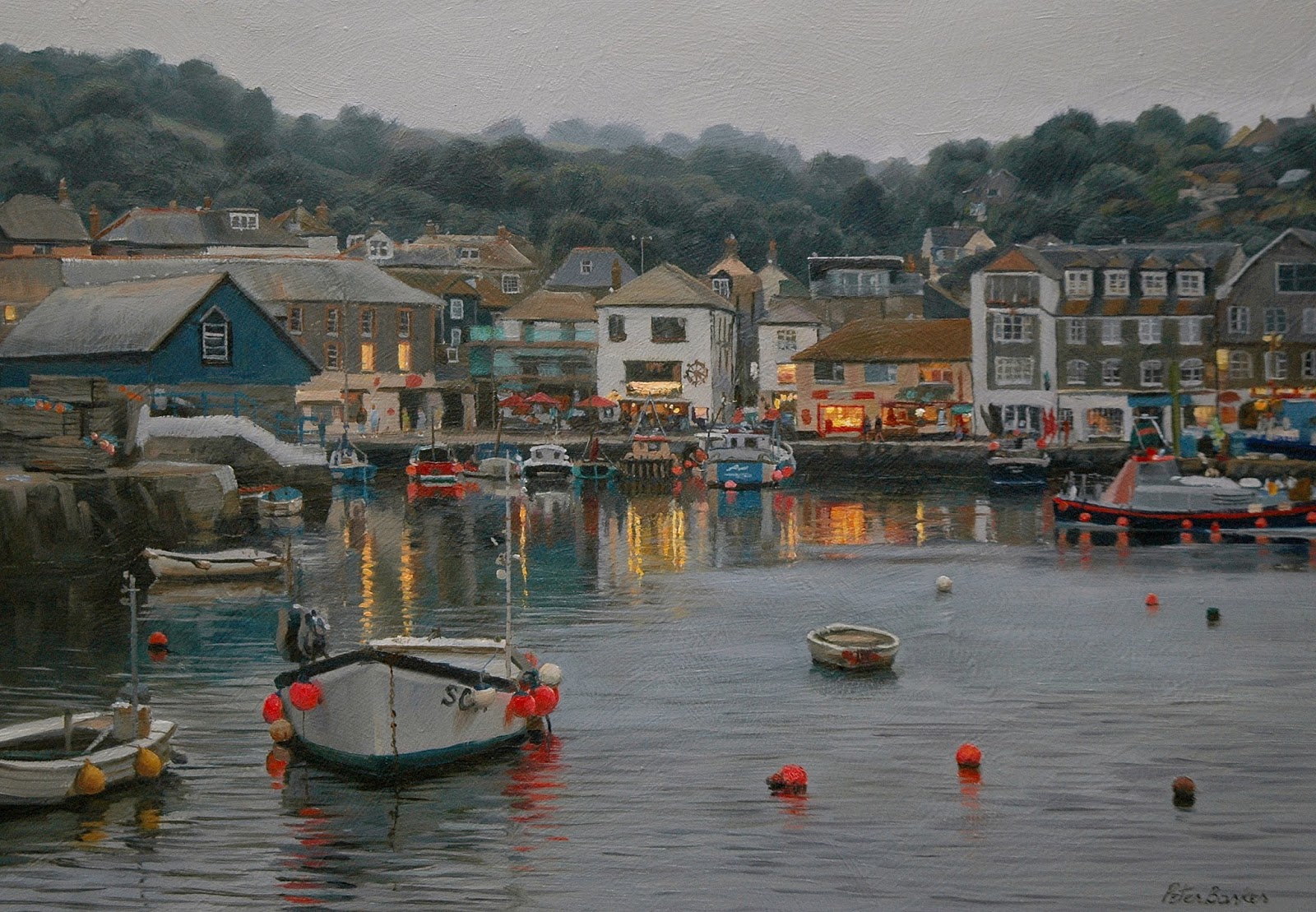
Quite a complicated painting this, with an awful lot going on throughout the piece. I like to keep the whole painting moving along at the same speed, because, as I always say in my demos, if you concentrate on one passage, without putting down the adjacent tones and colours, whatever you have painted will look very different when the colours next to it are placed - every colour and tone is relative to the next one, and cannot be guessed until they are all placed.

You can clearly see in this stage, that the pinkish tones in the water in the bottom left third are way too light, but until I scribbled in the tones below I wasn't sure. Had I completed that passage, I would have found the tones too light and would have to change them after spending time getting them what I thought was 'right'. And, the foreground boat, although a white boat, appears much darker than that because we are looking directly into the sunlight.  Again, I had to place the approximate tones of the hull down first, then the surrounding tone of the water placed immediately in order to ascertain the correct relative tones to each other, mostly by trial and error.  The trick of getting a scene to look 'real', is to recognise the errors, and correct them. Many amateur paintings fall down because the tones aren't right, so that there is no punch or impact.

The final bit of the painting was to whack in the sparkly spots of reflected sunlight with my lovely soft Schminke Titanium White - see how these spots bring the painting to life. 

This is the last painting that is going to the RSMA show, and is being collected tomorrow morning at 5.30. I'm writing this as I'm waiting for the wax to dry on its frame, so I had better set to and fit it in its frame... 

Thursday 21 July 2016

Sheds and Sunlight, Brancaster Staithe

Pastel on Pastelmat, 13 x 19 inches

This is the second Pastel painting that I'm entering for the RSMA exhibition, with one more big one to go...

The gloriously tatty sheds and huts at Brancaster Staithe are gifts for us artists, and, combined with the boats in the staithe, and the sharp, morning light, made this an irrisistible subject for a painting. The only thing I did was to move the foreground boat a little to the left for the sake of balance.

I could equally have tackled this painting in Oils, but I did love painting those dazzling spots of bouncing sunlight on the tops of the boat cabins, which are particularly suitable for the Pastel medium. That lovely, wet mud below the row of wooden posts was alittle more tricky with the dry medium, with myriads of little stabs of blue, mauve, grey, yellow, green-brown and white, whereas with the Oil medium, I would have painted much of this passage with the palette knife dragged over the blue-grey reflected sky colour.  Ah, the joy of painting!

Wednesday 13 July 2016

Leaving Port, Mevagissey, 5am

Pastel on Pastelmat, 19 x 24.25 inches

I painted this one from a high viewpoint, looking down on the harbour wall at Mevagissey, with a lone fisherman on his way out to make his catch. The light breaking through the clouds was spectacular, and I did my best to capture that fleeting light effect of the light on the sea, this time with the soft Pastel medium.

Pastel lends itself to making lots of little marks as the subject might require, as it did here in the bottom half of the picture. The gentle swell of the sea provided gorgeous stripes of grey and pink as the light reflected off the water.  Placing myself so that the lighthouse punctuated the lightest part of the sea, directly below the break of yellow light in the cloud offered the best composition I felt, and I think it's worked out alright.

Now onto more Pastels...
 

Thursday 7 July 2016

Harbour Lights, Mevagissey

Oil on Board, 11 x 16 inches

Another Oil for the RSMA exhibition, but why, oh why, did I elect to do this subject on such a small panel?  What was I thinking of? It is one of the most complicated paintings I've done, with an AWFUL lot of fiddly detail and a seemingly infinite number of colour changes and subtle shifts of tone. 

It was the beautiful half-light one encounters when the sun goes down, and when the shop and restaurant lights appear so much brighter, that drew me to the subject and to tackle it in paint. Those lovely yellow and orange reflections in the water were irresistible and I had to make sure that all the relative tones were dark enough, to give those light reflections the right impact. The red buoys also take on a glow in the evening, so there is a LOT of local colour in the painting.

Saturday 2 July 2016

Frosty Shoreline at Eyebrook

Oil on Board, 14 x 20 inches

This is a commissioned painting of Eye Brook and the Eyebrook Reservoir in Rutland, in its Winter garb. Actually, painting frost is one of my favourite subjects, especially this one, with lots of tufty grass tussocks, and really lends itself to the Oil medium using my decorator's brush - muted colours, using my usual three yellow, red and blue culprits, with the addition of a little Viridian here and there, and plenty of Titanium White of course.  The Swan and the few ducks lend a little life to the serene scene

Friday 1 July 2016

Surf and Turf

Oil on Board, 9 x 16 inches

Lovely jagged cliff shape here at Mawgan Porth, set against the late afternoon sky with gorgeous reflections in the wet sand was the inspiration for this one. I opted for a panoramic shape for the composition so as to concentrate the eye on the cliff and piercing yellow sky in the lower portion of it.

All done with four colours, there was a surprising amount of colour - I loved the Viridian in the crashing breakers and the resulting white surf - just perfect! 

Wednesday 29 June 2016

Tide Out, Porlock Weir

Oil on Board, 9 x 12 inches

Another offering for inclusion in the RSMA exhibition later in the year.  I don't often paint boats in such flat light, because sunlight throws such beautiful shadows from the vessels, and the shape of them is so defined by the highlights and darks.  But this one seemed to offer a lovely composition from the  footbridge at Porlock Weir. There were no shadows at all, but I loved the rhythm of the boats, taking the eye through the painting from bottom to the top, and the complimentary blues and oranges seemed to glow in the dull light - a phenomenon I've often noticed with scarlet poppies in the half-light as the sun goes down.

I've probably taken the detail a little too far, with lots of fiddly buoys and trims, but I inevitably seem to, because I love those subtle shifts of colour and tone in describing objects...ah well. I painted quite a lot of the slippery mud with my palette knife dragged over the undercolour, almost sculpting the paint in three dimensions. I rarely use the knife, but I do love it for this technique.  I put the figure in, just for a bit of life.

Thursday 23 June 2016

Blinding Light, Brancaster Staithe

Oil on Board, 7.5 x 10 inches

This is just a little painting, and should have been dashed off pretty quickly, but I did a lot of repainting in an effort to get the relative tones right - those progressively lighter tones of the background buildings.  I tend to paint the tones just a bit too dark, and it was quite a struggle in this case to pitch the tones in a high enough key.

This is a painting I shall be putting in to the Royal Society of Marine Artists annual exhibition at the Mall Galleries - one of six. I wasn't quite sure this was a real winning composition, but having done it, maybe I could have done a bigger version - I'll see what the response is here and on Facebook - always a good arbiter of such things!

Saturday 4 June 2016

The Pink Hat

Oil on Board, 12 x 17 inches

This is another one I had forgotten about, having done it as a demo last year, I think!  It too, was tucked away in a corner of the studio, and I felt it was worth working up into exhibition standard.

On that point, I think it's worth mentioning that some plein air artists tend to leave their work 'as is', and consider working on it in the studio to be taboo. Having run a gallery now for over a year, listening to the public's comments, I have realised that buyers don't give a damn whether a painting was completed on site, or in the studio. All they want when they part with their hard-earned money, is a beautiful piece of art on their walls - that is their ONLY consideration.  Re-working a painting and bringing it to a more 'finished' standard should not, in my eyes, be considered a no-no, and after all, we artists want to sell our work, don't we - there is nothing more heartening than to hear from a gallery that your work has sold.  It is definitely not prostituting your work to use a photo as an aide memoire - the spade-work is done on site after all. Why I'm telling you I don't know - I should be telling artists this!  

Having said all that, to work in the open air is much more stimulating than the comfort of a studio, and nothing compares to the drama of having to fight with changing light, and when you do bring home a 'finished' painting, the sense of achievement is exhilarating.

Eye Brook to Eyebrook

Oil on Board, 12 x 17 inches

I actually posted this one last July when I painted it as a demo in the gallery, (did I mention I have a gallery....) but I felt it was a little blue, which is always a problem when painting under artificial, warm lights - your eyes compensate for the yellowy-orange lights and paint cooler, bluer tones.

So, having languished in the studio for nearly a year, I reworked it under daylight lights, and the result is more pleasing, I think.

The view is one of the Eye Brook near the gallery (I did mention I have a gallery, didn't I?), which runs into the beautiful Eyebrook Reservoir...hence the title. 

Wednesday 1 June 2016

Burdock and May Blossom

Oil on Board, 6 x 8 inches

Hawthorns are adorning our hedgerows with their beautiful May blossom at the moment, and here they are by the River Welland, in various states of bloom and wain.

A lot of this little painting was done with my 1" decorator's brush, save for the sheep, the grass they're feeding on, and the water. The big leaves in the left foreground are those of the Burdock, with last year's dried seedheads next to them. Goldfinches love these seeds, and they supply our most beautiful finches with food throughout the Winter. Sometimes there are as many as twenty or so feeding on the heads of one plant whenever I have walked this bank in January.

Quiet Summer Day by the Nene

Oil on Board, 5.25 x 7.25 inches

Not a 'shouty' painting this one, with summer clouds stopping sharp, sunlit highlights so that the whole scene is somewhat muted, and none the worse for it.  
I placed the horizon relatively high on the picture plane, about in the middle actually, to focus the eye on the water, which was relatively the easiest passage of a painting. The picture would have been a little boring with the reflections mirroring the trees, but the foreground reeds provide a convenient foil to disrupt the otherwise uniformity.

I'm often asked if I use a rigger to paint the reeds; actually, I paint them with my favourite brush - a No 5 Long Flat Series 279 by Rosemary and Co. This brush forms the most beautiful chisel edge, and when loaded with paint, can describe the perfect shapes of reeds, maintaining its keen edge like no other brush can - I LOVE it!  A rigger can't do the job nearly so well, and I only use it to pick out the occasional sunlit reed in the distance, or some tree branches, and to sign my name!

Slow River

Oil on Board, 5.25 x 7.25 inches

Simple composition this one, and very much my sort of painting of high Summer on the River Welland in Rutland, with thick vegetation of reeds and pink Willowherb and Yellow Water Lilies punctuating the water surface.

Monday 30 May 2016

Big Clouds

Oil on Board, 5.5 x 7.5 inches

I'm going to be guest artist at Patchings Art Festival on Friday June 10th - next week - and suddenly realised that I'm going to have very little to have displayed because we've sold my work so well in the gallery...did I mention that I have a gallery, Peter Barker Fine Art: www.peterbarkerfineart.co.uk (other inferior galleries are available :))

So, I'm going to be grafting away in the next week to get a few little'uns painted and framed-up ready for the festival, so watch this space for more! 

Here's the first one - very topical, with so many bright yellow oilseed rape fields adorning our countryside. Often, skies are very secondary to the rest of the landscape in my paintings, but here, with those lovely billowing cumulus clouds, the sky had to have at least equal billing, so I made the horizon low in the picture plane to emphasise the majesty of the clouds.


Friday 27 May 2016

Snow Lane

Oil on Board, 10 x 12 inches

Can it really be a month since I last posted a painting - blimey! I have done a couple during a trip to the Isle of Skye, but this is the first exhibition standard effort. It's actually a commissioned piece, hence the non-seasonal theme.

Oaks generally are the last leaves to turn their Autumnal brown, and this scene in December shows a lot of leaves still hanging on, providing a lovely foil to the cool blues and white of the snow. The view is a lane not far from my studio, with a little artistic licence employed by putting in the two barns as required by the client.

Friday 29 April 2016

River Welland by the Harringworth Viaduct

Oil on Linen Canvas, 16 x 22 inches

This is the first in a string of commissioned paintings I have to complete. The couple concerned wanted a view of the iconic Harringworth Viaduct which crosses the River Welland on the border of Northamptonshire and Rutland. It is 1,275 yards long - the longest masonry viaduct across a valley in Britain, has 82 arches, each of which has a 40 feet span, took 2 years to build and was completed in 1878 - I'm full of useless information... 

Anyway, fantastic structure though it is, I felt a painting just of the viaduct would be somewhat dull and boring, and inevitably repetitive - an arch is an arch, and with 82 of them, all identical, there's little to make a painting interesting. A photograph, yes, but a painting, hmmm. So, I guided the clients to opt for a painting of the beautiful river, with the viaduct as a backdrop, simplified against the strong morning sunlight into a predominantly blue shape, rather than a portrait of the structure itself, and hopefully, this has worked.

Thursday 14 April 2016

Light Summer Breeze

Oil on Board, 11 x 16 inches

This was another demo painting I did to the Colourwheel Art Group at Alwalton in Peterborough a few weeks ago. It's a view of the River Nene from a bridge at Cotterstock near Oundle. 

I've painted from the same spot before, and in summer too, but this one has a different feel to it - the first one I did was on a sharp, bright Summer's day, with billowing cumulus clouds and blue sky, with the water very ruffled by the wind. This one, the sky was somewhat overcast, with the occasional shaft of sunlight lighting up the landscape - one of my absolute favourite light effects. As I said in my demo, the lightest part of the painting are the Yellow Water Lily pads in the right foreground of the river. To make these 'sing', the sky and water had to be painted correspondingly darker - as ever, the tones are THE most important parts to get 'right', so that the eye 'reads' everything correctly, and the light effect I experienced can be conveyed to the viewer.

Wednesday 13 April 2016

Roach Pool on the Nene

Oil on Board, 10 x 14 inches

I found this painting on a shelf - painted last year and forgotten about, so dug it out and framed it!  I actually did a small study of this a few years ago and revisited it with this larger version, with one or two alterations. I also did a same-sized plein air painting from almost the same spot a couple of Summers back - a most glorious bit of river near Waternewton.